User Tag List

Page 3 of 3 FirstFirst ... 2 3
Showing results 31 to 40 of 40

Thread: Nick Blais Cd Covers

  1. #31
    Shmegma Stand Steel's Avatar
    Join Date
    Feb 2004
    Location
    Boston, MA
    Age
    37
    Posts
    5,865
    Battle Record
    3-1

    Re: Nick Blais Cd Covers

    GFX, work like this won't make you "one of the best" on even the worst forum on the net. You are well below mediocre. Brandon Cee basically summed up why I don't post graphics anymore. It's nice of you to give people "constructive criticism", but in all honestly, any advice coming from you isn't going to help anyone excel when you suck as much as you do.
    Rape a pregnant bitch and tell my friends I had a threesome

  2. #32
    end of tha world -:rapture:-'s Avatar
    Join Date
    Apr 2005
    Location
    straight off a cops ass
    Age
    38
    Posts
    120

    Re: Nick Blais Cd Covers

    well i have to agree these guys r haten...plus did u see the cover the dude had....this is definily a step up from the last cover...keep up the good work GFX

    To view links or images in signatures your post count must be 50 or greater. You currently have 0 posts.

  3. #33
    Newbie
    Join Date
    Aug 2009
    Location
    south point, ohio
    Age
    38
    Posts
    16

    Re: Nick Blais Cd Covers

    shit i think its phat just simple not to much sometimes simple is better

  4. #34

    Re: Nick Blais Cd Covers

    Quote Originally Posted by -GFX- View Post
    they can hate all they want....i've seen nothing dropped by them...and honestly this is what the CUSTOMER wanted.....i do stuff based on what they want...not what i want...so hate all u want.....i'm either the best or in the top 3 best gfx heads on the site...so get off my dick ty
    dude 2bh your not that great and on your dick? it's constructive criticism so stfu if your gonna get that hurt please don't post on forums no more

    To view links or images in signatures your post count must be 50 or greater. You currently have 0 posts.

    D.O.A.

  5. #35

    Re: Nick Blais Cd Covers

    gfx man a bitch...how u so busy but find time to comment on mah pics, send me pm's of yo fuckin video, post up a graffix thread, which u are attending and stayin active in... BUT U DODGE ME IN OUR BATTLE....U A FUCKIN CLOWN U SCARY ASS FAGGOT.....FUCK U FUCK U FUCK U!!!!!!!

  6. #36
    Taeisbeast.'s Avatar
    Join Date
    Feb 2005
    Location
    k o Я e a
    Posts
    6,289
    Battle Record
    110-0
    Awards 100+ Wins

    Re: Nick Blais Cd Covers

    and what kind of look were you going for?

    To me, its kinda plain, but again, not sure what look you wanted. Its okay but simple, yet effective in its own kinda way

  7. #37
    My Doe Flip Like Tae-Kwon Menace II Society's Avatar
    Join Date
    Jan 1995
    Location
    New York
    Age
    37
    Posts
    15,220

    Re: Nick Blais Cd Covers

    Quote Originally Posted by Co Cypher View Post
    gfx man a bitch...how u so busy but find time to comment on mah pics, send me pm's of yo fuckin video, post up a graffix thread, which u are attending and stayin active in... BUT U DODGE ME IN OUR BATTLE....U A FUCKIN CLOWN U SCARY ASS FAGGOT.....FUCK U FUCK U FUCK U!!!!!!!
    Lmao.. someone felt pretty hurt there..

    [YouTube]VTfrbU74TdE[/YouTube]

  8. #38
    I got fire! Rah Gwahn's Avatar
    Join Date
    Feb 2002
    Location
    UK
    Age
    34
    Posts
    2,793
    Battle Record
    1-0

    Re: Nick Blais Cd Covers

    Quote Originally Posted by -GFX- View Post
    here ya go


    and the back cover and traack list


    hope u enjoy
    Lol I'll tell you now you're not even one of the best bro. No hate, but I can't have you preaching and why-not'ing while I've got eyes on that title.

    First rule of using typography to display large bodies of information (In this case: Tracklisting);
    Never, ever put it over a noisy background. It distorts the image, and bores the eyes when people refer to it. This is because it's naturally harder to define, and when people have to read information, they don't want to make extra effort to do so unless it's done interestingly. Which this isn't.
    Not to mention, you need to bold and use a contrasting colour to make this text stand out against the background - in which case, what's the point of having a nice image under all of this in the first place? Think about that, go look at any decent album artwork and observe how 9/10 times, the designer puts tracklistings, lyrics and any other INFORMATION on a plain space in neat, regular type. No stroke or anything to need to thicken it up. Just plain type, with maybe a really soft drop-shadow to seperate the text from the surface. Ease of reading is key.

    The images are nice, and you don't need to do much more to them. In your defense, these images are fine to use. Nice, easy to take in, attractive and by all means generic to your title, which means minimal conceptual work - aka HARD work.
    The problem on this site is that unless you have an uber-psychedelic conceptual vision of mess going on, most people will prematurely hate your work. Ignore it. Good design is simple design, anything that clutters isn't going to do anything else but that.
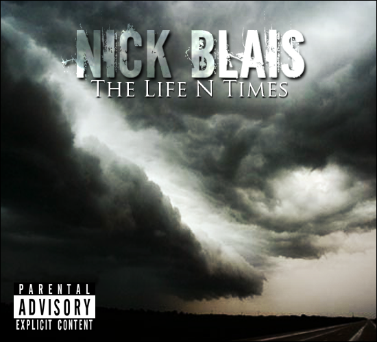
    On the other hand, the two images don't meet at all. The front image works better, the colour range is minimal and it's easier to work into. The back is too far away from the front, it's a different climate, different scenery, telling a different story. Not to mention none of the tracks you've so boldly listed have anything to do with that image.
    What you've done is taken a picture of a polar bear, and titled it 'Desert Sand'. Relevance is always key. If I were you, I would have stuck with the front image, and on the back, make it the darkest sampled colour from the front image for a plain background, and used the near-lightest sampled colour for the track listing. You've killed two problems, maybe three here.
    First, you've cleared the messy text/background situation right up.
    Second, you've cleared the problem of the two images not matching.
    Third, you've centered the focus for the artwork on just the front image, giving out one message which doesn't interfere with the names of the tracks, also giving out one colour scheme for you to use on the rest of the artwork.

    Composition is uninteresting, plain, bland. Pick one. The front text is awful, I personally hate fonts like that. Badly designed, badly applied, and terrible to print. If I were you I would have invested some time in looking through a lot of fonts and deciding which one is most SUITED to the background image and to the message of the artwork. Something clean, uncomplicated and crisp would have worked wonders given the right composition.

    Secondary text is nice, but get rid of the stroke. Fine-line type like that shouldn't need a black-on-white stroke approach to get it looking smart. Also think about how it IS your secondary type, so why would you need to make it stand out that much?
    If I were advertising my product, I wouldn't try to catch the customers attention with the small print.

    Finally, lose the parental advisory label. This isn't Eminem. You aren't going to watch this artist sell multi-national amounts of CD's. Chances are that this artist is going to get 200-300 printed, try and sell them all for cash in hand, and maybe give the leftovers out to family and friends that didn't already buy one.
    This isn't going to hit shops, or any kind of market where you're going to get fucked for not having the label on there. All it does it make it look pretentious and over-played.
    If this IS going to be sold in some kind of store, then it's not your duty to put the label on there anyway. It's the duty of the distributor, because he/she is the responsible person that may be selling this to anybody under-age.

    Over all, I think it's OK. It's not complicated, it's far from shit. I just think you need to spend a hell of a lot more time researching your approach, and take some time out of your busy GFX profession to actually study the subject itself, and then you'll work out why I laughed when I read this.

    There's some constructives to chew on, easy bro.

    Oh one more thing, you should think about a way to number the tracklisting. It ain't a tape, it's a CD. When they change the track, it comes up with a number. Not a name. It'd pay to have a number that they can refer to next to the track surely?
    Last edited by Rah Gwahn; August 25th, 2009 at 10:41 PM

    To view links or images in signatures your post count must be 50 or greater. You currently have 0 posts.


    To view links or images in signatures your post count must be 50 or greater. You currently have 0 posts.

    [Po'Ethics][Written Voices]

  9. #39
    weightless
    Join Date
    Oct 2006
    Posts
    1,196
    Battle Record
    24-18

    Re: Nick Blais Cd Covers

    sucky
    The Greatest

  10. #40
    You've Earned a Custom Title! Tommy Prophit's Avatar
    Join Date
    Sep 2009
    Location
    Las Vegas, NV
    Age
    32
    Posts
    271

    Re: Nick Blais Cd Covers

    The front cover is great! But the back cover isn't as good >_> The front could of still been improved even more if you spent more time on it though.

Similar Threads

  1. Nick Nice vs Nick Fletcher
    By Erupt in forum Closed Battles
    Replies: 33
    Last Post: February 9th, 2009, 01:07 PM
  2. Week 8 (0-0) Kstroyer Vs (0-0) Poetic Blais
    By Massive in forum Closed Battles
    Replies: 4
    Last Post: July 25th, 2002, 10:20 AM
  3. Week 2: CoNstaNT vs Poetic blais
    By Q in forum Closed Battles
    Replies: 1
    Last Post: June 12th, 2002, 12:12 PM
  4. Poetic blais - 0-0 vs CoNstaNT - 0-0
    By Q in forum Closed Battles
    Replies: 2
    Last Post: May 13th, 2002, 12:46 AM

Posting Rules

  • You may not post new threads
  • You may not post replies
  • You may not post attachments
  • You may not edit your posts
  •